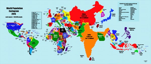
Here is the latest version of the world map by population has been created by a person who has a passion for geography.
A map of the world that is based on the population and was inspired by the population map that was posted on Wikipedia based on data from over 10 years ago. The Wikipedia version is scaled on dots with one dot = 100 million people on the map. The author of the map below decided to alter the ratio to one dot = 50 million people on this map.
source: redd.it
Here is the map
 Enlarged Map Image
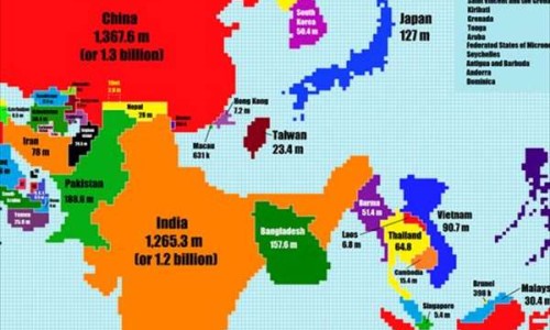
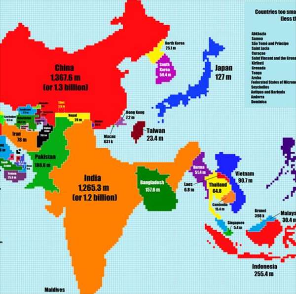
When the above map is enlarged, Japan looks quite big when using the scale of population!
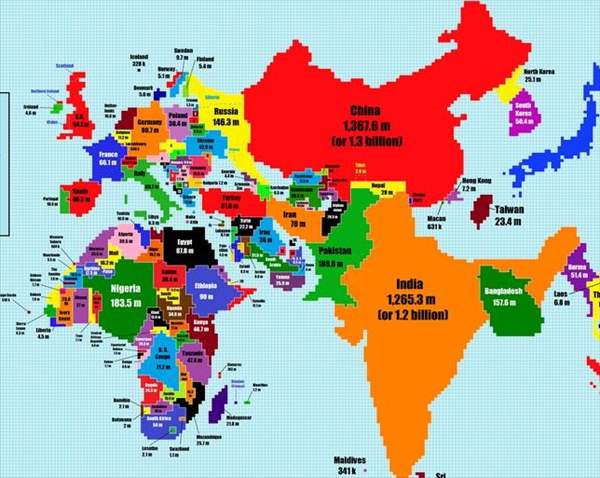
Russia is the country with the largest land area and a large population so it has a significant size in this map.

China and India are both massive on this mapping scale!
This map has caught the attention of a lot of people online who seem to enjoy this scale and content created by the author. Here are some of the comments by online viewers below.
sourceredd.it
Here is the 2005 edition of the map below. As you can see, North Korea with a population of 25 million surprized a lot of viewers with this little known fact.

What did you think?
It is interesting when we compare countries of the world on different scales!
The size of the countries is relative on this scale of map.
・Comparing the sizes of Japan and the United States, Japan is shrinking while the United States continues to grow larger.
・The population density of South America is well-represented on this scale of map.
・The population of North Korea is roughly the same as Australia.
・The population density of Europe and South America is approximately the same.